Branding
Graphic designs centred around providing a clear, quick-to-understand image of a business with elements, fonts and colours that support that message.
-
![Logo for PhysioCare Townsville featuring a stylized orange figure performing a dynamic pose with the name and location.]()
Developed for a local physiotherapy clinic, the design represents the friendly image that the owner wanted to portray and incorporates the joyous feeling that patients may experience when they regain a wider range of movement and pain is eased after treatment of their ailments.
-
![Logo for 'What's On When' with a clock graphic and tagline 'Every event, everywhere'.]()
Designed for an app that locates events in your local area. The app was a business startup at the Townsville Startup Weekend.
-
![Logo of Inspect with a city skyline graphic above the word "Inspect" in gray and blue colors.]()
Created for an app that facilitates building site inspections. The app was a business startup at the Townsville Startup Weekend.
-
![Logo with the word 'CRASH' in large white letters on a teal background.]()
Developed for an app that connects people looking for short-term accommodation at short notice with people who would like to earn a bit of money from hiring out their couch or other small areas of their home. This logo was developed for a startup team at the Townsville Startup Weekend.
-
![Disport logo with the tagline "Your Game Unchained" under a stylized yellow swoosh.]()
Created for an app that connects sports players with other players and venues for sports activities. This logo was developed for a startup team at the Townsville Startup Weekend.
-
![Logo with pink flowers and the words 'Blossom Florist' in pink script.]()
The concept of this branding centred around the feelings of love and happiness that may be experienced with giving and receiving flowers. The graphics, cheerful pink colour and swirling font work together to create a cheerful, friendly and loving impression.


This branding was created and entered into a competition for Townsville’s 150th year anniversary. The key elements of Townsville and celebration were considered. Castle Hill, the Strand, and fireworks were included to incorporate these elements. Though it did not win it is similar in concept to the winning entry. The winning entry also incorporated the elements of Castle Hill and The Strand but in addition, included community and the sun which are important characteristics of Townsville and the spirit of the celebrations.
Marketing
Utilising graphic design, photography, and video that expresses a business’ core values and conveys how their products or services can meet a potential client’s needs.
Stationery Kits, Merchandise and Facebook Branding


Credits: Illustrations supplied by Northern Australia Primary Health Limited.
Magazine
This magazine design featured local adventure activities. The magazine was aimed at the Gen Y age group. The style of the magazine reflected the target age group as it was modern with a little bit of roughness, representing adventure, brought in through textures in the magazine title and the tire mark pattern.


Credits: Cover design and ‘Feel the Power’ article by Liz Lorelle. Cover photo by Kevin Whelan. Article photos by Bannon Keft. Tire marks graphic by PSDgraphics.com Photo of Garrett turbo from turbobygarret.com Dyno Dynamics logo from eccustoms.com
Tri-Fold Brochure
The tri-fold design was selected as it is a common size and the brochure would be easily displayed in standard display holders in tourist centers. A round die-cut was selected to reflect the circle shape in the flag. The die-cut was placed near the top to illustrate the sun, reflecting the meaning of the circle on the Japanese flag. A picture of a skier was placed on the front cover to give the viewer a quick, visual indication of what the trip is centered around. The colour theme of red and pink was chosen, as this colour combination is commonly used in Japan.


Credits: Front cover skier photo from roughguides.com Inside photo of fire festival from tsunagujapan.com Inside photo of skier from unravelledtravel.com All other photos by Bannon Keft. Illustration from clker.com Font (Bonzai) from urbanfonts.com
DL Brochure
This brochure was designed for a boutique bed & breakfast in the Atherton Tablelands. The wavy design of the lines across the front of the brochure represents the river which is one of the main features of the property. The brochure describes the main attractions, the facilities, and the unique opportunities offered by the hosts John and Pam de Rooy.


Credits: Photography by Ross Eason and John de Rooy. Written details provided by John and Pam de Rooy.
Online Graphics
These graphics were designed for a showcase video launch event of Townsville Creative Industries. Photos were chosen that demonstrated the collaborative essence of Townsville Creative Industries and some of Townsville’s creative professionals in action capturing video footage for the film. The branding for Townsville Creative Industries and the information for the launch event was clearly displayed in the images. The images were sized and formatted for a Facebook banner, Facebook invite, email invite, and Townsville tickets image.


Credits: Branding created by Vetta Productions. Photos supplied by Townsville Creative Industries.
Email Header
The email header was designed to fit the sizing specifications for Mailchimp email marketing formats. The header was designed to look corporate but with an edginess to incorporate a sense of innovation.

Credits: Photo provided by Innovation NQ. Logo designed by Naomi Adams.
Infographic

Topic: Organising and Decluttering
Target Audience: Young women desiring more organisation and less clutter in their homes. Questions Answered: Why organise? What are the benefits? What system can be used to declutter and organise?
Category: Solve a problem
Organisation: Time and Category
The purpose of this poster is to inform young women who desire more organisation and less clutter in their homes of some statistics related to clutter, the associated psychological characteristics, the benefits of decluttering and a system to guide in the decluttering, organising process.
Each element of the design plays an important part in conveying the overall message of the infographic poster. The title was formed to illustrate the messy, disorderly state clutter with the subtitle styled to reflect a neatly, organised state. The main home illustration was drawn to reflect the category of home organising. The clock illustrates time spent looking for lost items. The brain illustration provides a visual link with the psychological information. The other small illustrations provide interest to the streamline system of organising.
The colours were selected for good contrast. The orange represents happiness and light-hearted feelings that can be achieved from decluttering. The blue represents the calm, refreshing effect of a tidy, organised home.
The styling of drop-shadows and glow effects provide depth to the elements of the design.
Credits: Organising tips on right hand side of infographic sourced from the book ‘The Joy of Less’ by Francine Jay.Decluttering benefits sourced from the book ‘The Floor is Not an Option’ by Sheila McCurdy. Associated psychological characteristics statistics from clutterless.org The remaining statistics are from napo.net
Flyers
These flyers were designed for headspace and MeToo group sessions at the Youthhub, Townsville. The sessions helped support the mental health and wellbeing young people in the Townsville region.


Credits: Photos and swirl illustrations supplied by headspace. Written copy supplied by headspace and MeToo.
Newspaper Advertisements
These advertisements were designed to promote the services of Northern Australia Primary Health Limited. Mental Health and Wellbeing, Indigenous Health and Allied Health. The images were printed in local newspapers in the Northern Queensland region.


Credits: Photos and swirl illustrations supplied by headspace. Other photos and illustrative elements were supplied by Northern Australia Primary Health Limited. Written copy supplied by headspace and Northern Australia Primary Health Limited.
Uniforms and Promotional Items
The following uniforms and promotional items were designed to promote Northern Australia Primary Health Limited and it’s Integrated Team Care services for Indigenous health.


Credits: Illustrative elements supplied by Northern Australia Primary Health Limited. Written copy supplied by Northern Australia Primary Health Limited.
Pull-up Banners
These banners were designed for Big Mike’s Batteries & Mobility Scooters to capture attention and communicate contact information at events and displays within the local community. The scooters were photographed and the backgrounds were removed to provide high resolution images to utilise on the banners and future large-scale projects.


Credits: Logo and written copy supplied by Big Mike’s Batteries & Mobility Scooters. NDIS logo utilized from NDIS logo pack.
Social Media
Eye-catching social media images with informative messages for posting on various online social media platforms.
Ross Funerals: Facebook Posts
Custom-designed online funeral notices created for funeral services at Ross Funerals from April through to November 2021. Community engagement posts created for national special days related to the funeral industry.
Credits: Photos supplied by deceased’s family and graphics utilised in Canva. National days posts written by Elisabeth Collier and images from Unsplash.
Great Barrier Reef Marine Park Authority
The following images were designed for the Great Barrier Reef Marine Park Authority from May through to December 2018. The images were used to maintain their social media presence and share educational information regarding the Great Barrier Reef and marine life in the region.
facebook.com/GreatBarrierReefMarinePark/
Instagram and Facebook Stories


Credits: Text sourced and supplied by the Great Barrier Reef Marine Park Authority except where otherwise stated. Images supplied by the Great Barrier Reef Marine Park Authority. Illustrative elements supplied by canva.com
Northern Australia Primary Health Limited
The following images were designed for Northern Australia Primary Health Limited from April through to December 2017. The images were used to build up their social media presence and share information regarding national and world health days and Indigenous commemorative events.
instagram.com/northernaustraliaprimaryhealth/
Instagram and Facebook Posts


Credits: Aboriginal and Torres Strait Islander graphic elements supplied by Northern Australia Primary Health Limited.
Blossom Florist
Images designed and sized for optimized viewing across various social media platforms. Images created to promote Mother’s Day and new bouquet designs.


Websites and UX/UI
Utilizing user experience/interface design to create websites and applications that promote a business in a straightforward manner that is intuitive and easy to navigate.
Websites and User Experience/Interface Design
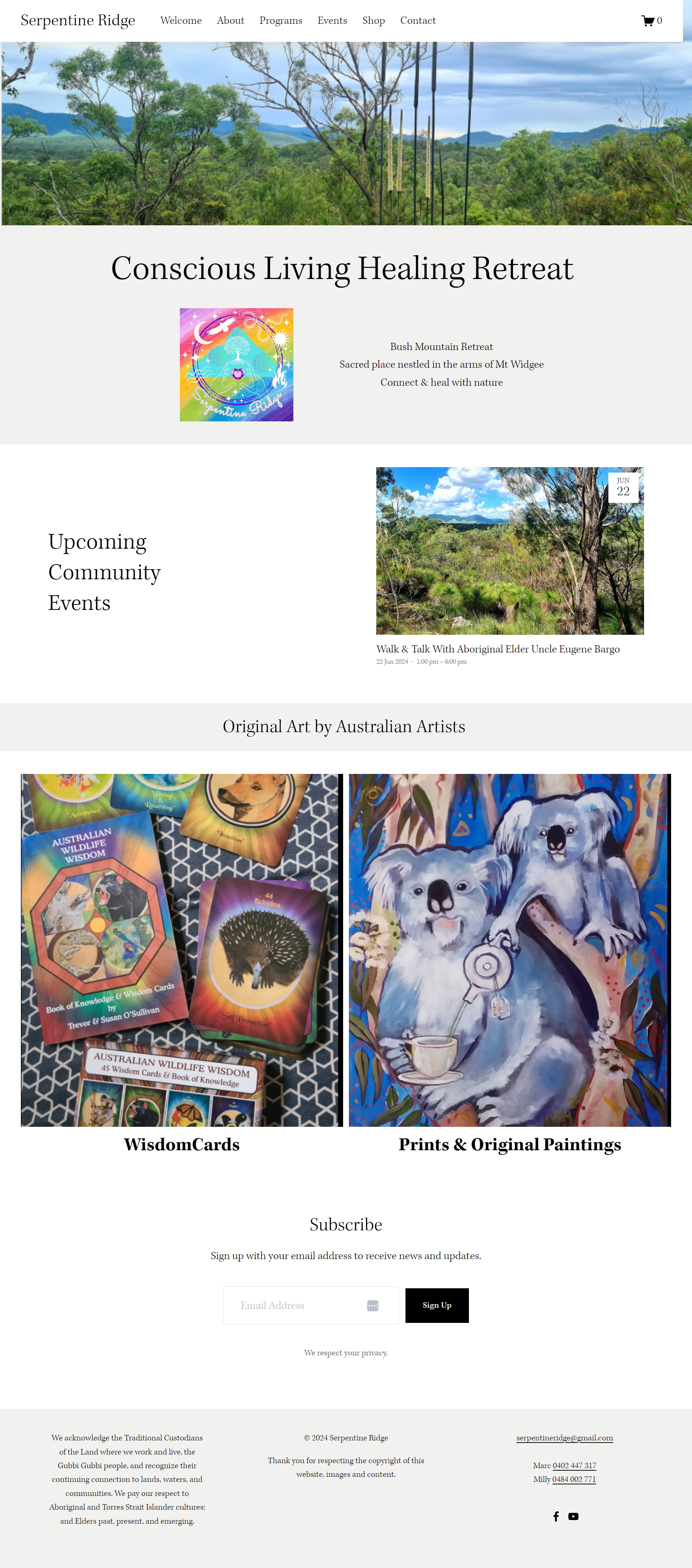
Serpentine Ridge Conscious Living Healing Retreat
Serpentine Ridge is a website for the retreat owners Marc Bright and Milly Hine to operate as a central hub online for sharing information about their offerings, selling tickets online for their events, and with the further goal of marketing their art and school-age educational programs to a worldwide market.


Momentum Graduate Exhibition
Momentum2016 was designed and created for the 2016 graduating class of Bachelor of New Media Arts students at James Cook University. It was designed to provide information to support the graduate exhibition, Momentum, held at Perc Tucker Gallery, Townsville from October to November 2016. The website also provides a continuing source of promotion for the artists who exhibited.


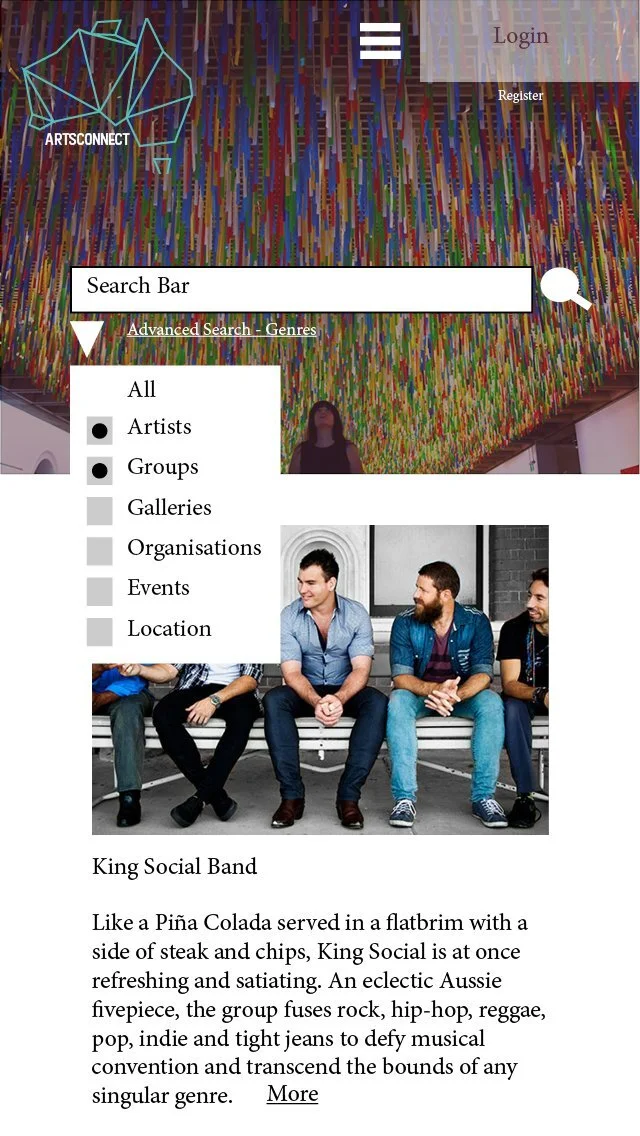
ArtsConnect
ArtsConnect was a collaborative proposal, with Stefi Klein, Emily Haire, and Mikayla Mayoh, to design, update and relaunch the National Library of Australia’s online directory and community for artists. Research was conducted and case studies were formed to identify current online directories and artist communities and establish points of difference for the ArtsConnect website. A wireframe of the website format was designed to establish the layout and usability of the website for both desktop and mobile devices. A mockup of the website design was then created based on the wireframe layout in order to present a visual example of the website layout and content.
Photo credits: Photography by Red Sky, King Social, Reuters/David Gray (AUSTRALIA – Tags: SOCIETY TPX IMAGES OF THE DAY), Matthew Gianoulis Photography & Design, Australian Institute of Photography (AIPP) and Perc Tucker Regional Gallery, Townsville